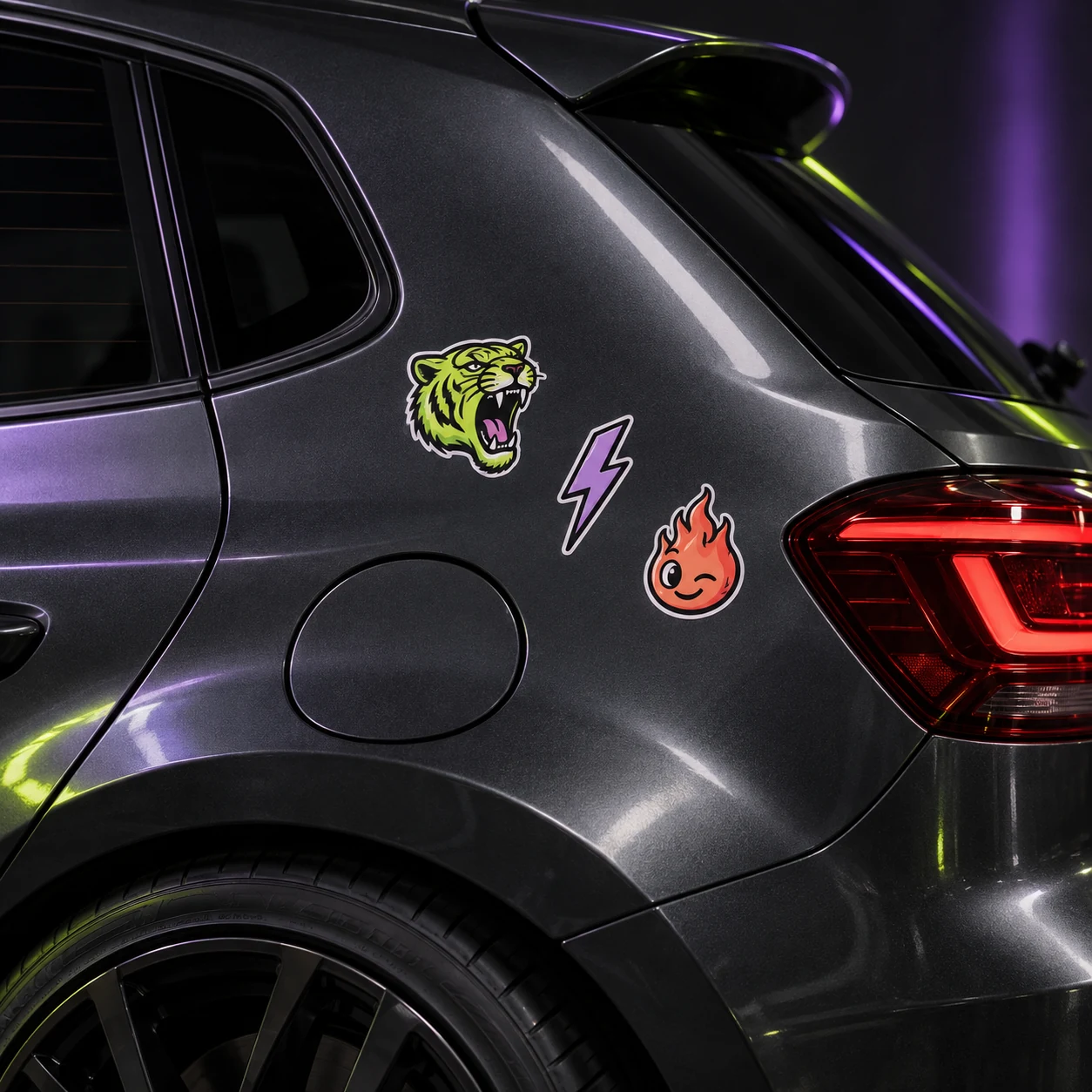
THE STICKERROAR GUIDE
Matching a Sticker to a Light-Colored Car
Compare the design's lightest edges with the car surface before deciding that a pale palette will stand out.
Updated
What to know
Light artwork can feel subtle on a light surface, while dark outlines create clearer separation. Decide whether you want the sticker to blend gently or read immediately. Use the actual design edge in your comparison rather than judging only the colors near its center.
Check your plan
- Check the outer edge against the surface color.
- Compare a dark outline with a pale border.
- Choose subtlety or contrast deliberately.
A practical example
A white flower can remain readable when its center and outline are strong. A pale flower without a defined edge may need a different composition or placement.
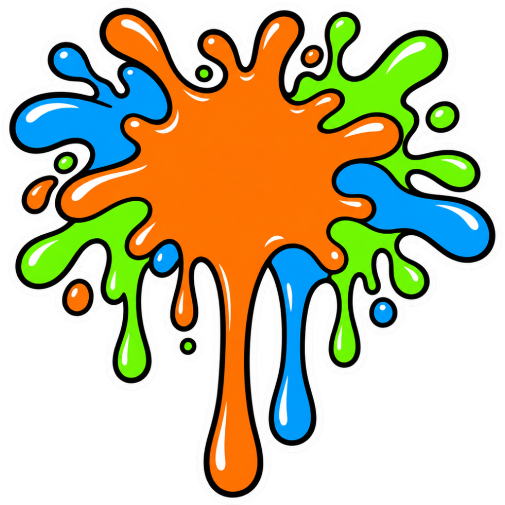
The cover is an artwork example from the catalog. Use the measurements and file checks above to evaluate your own project, rather than treating the image as a scale reference.
Explore the options
Browse abstract and symbol car stickers or prepare your own custom sticker. Product pages let you compare the artwork, size, material and pack quantity. You can submit an order request without payment; final details require confirmation.