THE STICKERROAR GUIDE
Comparing Glossy Stickers Under Different Scene Lighting
Use more than one viewing context when judging a shiny-looking finish in the editor.
Updated

What to know
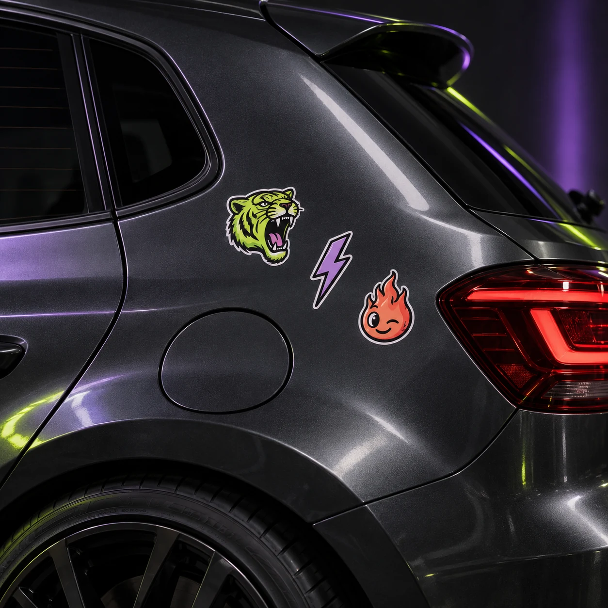
A glossy-style effect can emphasize reflected light in a scene. That may make colors appear vivid in one view and make part of the artwork harder to inspect in another. Review the flat artwork first, then use the scene as a comparison tool rather than a physical lighting prediction.
Check your plan
- Check the image outside the scene.
- Compare light and dark surroundings.
- Confirm important color or reflection requirements with a sample.
A practical example
A bright reflection crossing a small slogan can make a preview harder to read. The underlying text should still be checked independently at its intended size.
The cover shows a catalog artwork example. It is not a physical material test or an installation demonstration. Confirm product-specific requirements for your actual surface.
Explore the options
Browse abstract and symbol car stickers or prepare your own custom sticker. Product pages let you compare the artwork, size, material and pack quantity. You can submit an order request without payment; final details require confirmation.