THE STICKERROAR GUIDE
Comparing Finish for a Typography Sticker
Choose finish after confirming that the wording and letter shapes read clearly at the intended size.
Updated

What to know
A text-led sticker depends on readable shapes and spacing. Review the phrase without scene reflections first, then compare the available finish options. If a finish effect makes the preview harder to inspect, return to the flat design view rather than guessing at the lettering.
Check your plan
- Proofread the exact phrase.
- Check letter spacing at the final dimensions.
- Compare finish without changing the font or size.
A practical example
A short bold quote can be easy to compare across finishes. A dense script paragraph needs a layout decision before a surface-finish decision.
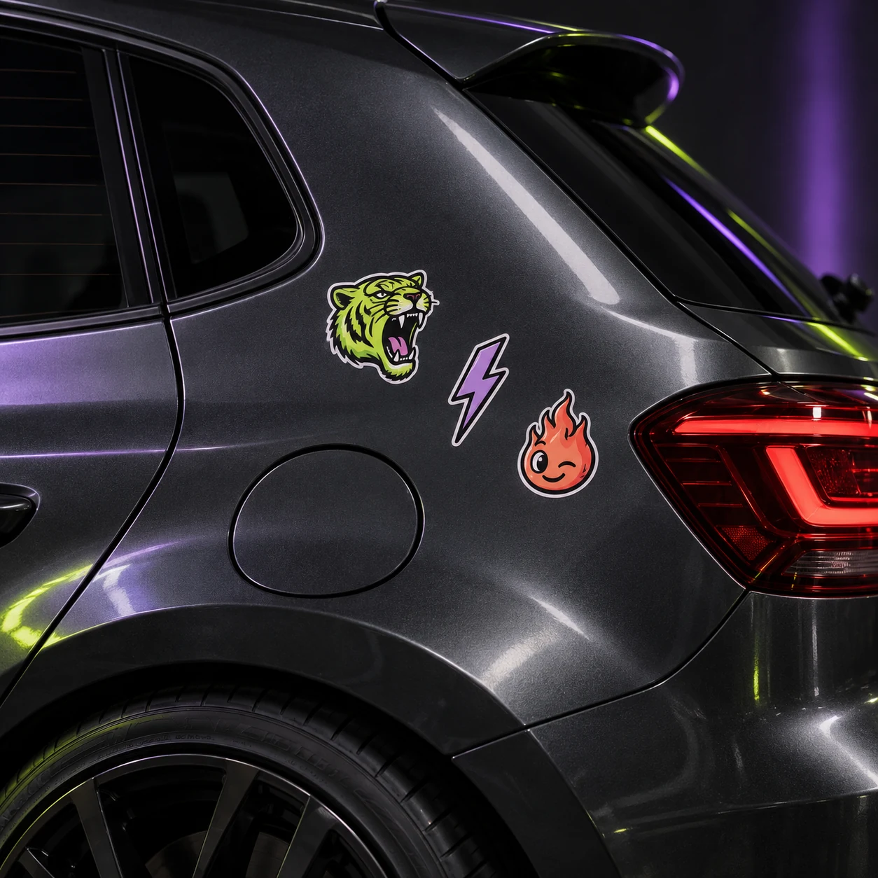
The cover shows a catalog artwork example. It is not a physical material test or an installation demonstration. Confirm product-specific requirements for your actual surface.
Explore the options
Browse abstract and symbol car stickers or prepare your own custom sticker. Product pages let you compare the artwork, size, material and pack quantity. You can submit an order request without payment; final details require confirmation.