THE STICKERROAR GUIDE
Comparing Matte Artwork Without Losing Contrast
Evaluate the design's own contrast separately from the flatter finish shown in the preview.
Updated
What to know
A matte-style preview reduces the impression of sharp reflection, but it does not fix low-contrast artwork. Check whether the subject is already clear in the flat design view. Adjust your own file when the colors or lettering are too similar rather than relying on a finish change to separate them.
Check your plan
- Inspect the design without scene lighting.
- Compare text and background values.
- Choose finish after the composition reads clearly.
A practical example
Dark gray letters on a black panel may remain difficult to read regardless of finish. Changing the artwork contrast addresses that problem more directly.
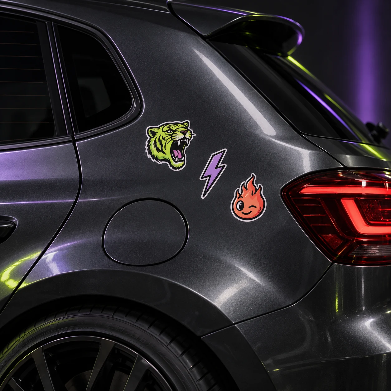
The cover shows a catalog artwork example. It is not a physical material test or an installation demonstration. Confirm product-specific requirements for your actual surface.
Explore the options
Browse racing and garage car stickers or prepare your own custom sticker. Product pages let you compare the artwork, size, material and pack quantity. You can submit an order request without payment; final details require confirmation.