THE STICKERROAR GUIDE
Adding Space Between Sticker Lettering
Use letter and word spacing to prevent a short message from becoming a dense block.
Updated
What to know
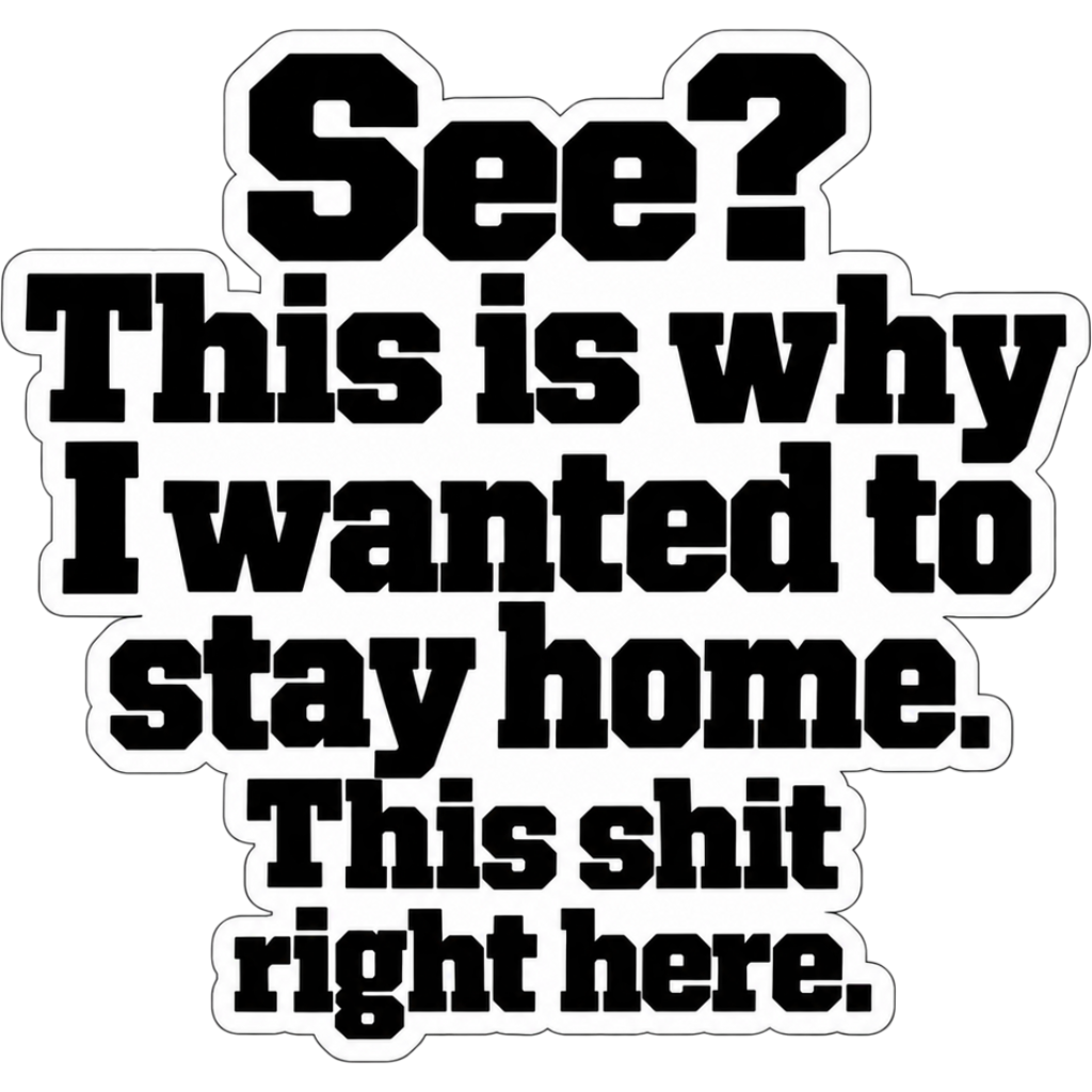
Letters need visible separation to retain their shapes. Tight spacing may suit a large logo but become confusing on a small sticker. Adjust your own artwork at the intended size, checking both the overall word shape and the smallest gaps between neighboring letters.
Check your plan
- Inspect touching or nearly touching characters.
- Compare word gaps with letter gaps.
- Review the phrase without zooming in.
A practical example
The pair 'rn' can begin to resemble 'm' in some fonts when spacing is tight. A small spacing adjustment can improve clarity without changing the phrase.
The cover is an artwork example from the catalog. Use the measurements and file checks above to evaluate your own project, rather than treating the image as a scale reference.
Explore the options
Browse funny and quote car stickers or prepare your own custom sticker. Product pages let you compare the artwork, size, material and pack quantity. You can submit an order request without payment; final details require confirmation.