THE STICKERROAR GUIDE
Choosing Readable Fonts for Small Sticker Text
Compare fonts for small sticker text at the intended physical size. Check similar characters, enclosed spaces and stroke shapes with a simple reading test.
Updated
What to know
A decorative font can look appealing in a large layout and become difficult to read when reduced. Look at the narrowest strokes and the spaces inside letters. For your own design, simplify the font or shorten the phrase rather than assuming a larger screen preview represents the printed result.
Check your plan
- Print the phrase at its intended dimensions.
- Check similar letters such as I, l and 1.
- Compare a simpler typeface with the decorative option.
A practical example
A short bold headline can survive reduction better than a long script sentence. Choose the font for the way the sticker will actually be viewed.
Test the actual message in two fonts
Set the same wording in your preferred font and a simpler alternative. Keep the finished footprint fixed, but compare the visible letter height as well: equal point sizes do not necessarily produce equal-looking letters in different typefaces. Print the two candidates and verify their physical dimensions with a ruler.
Include the characters your design actually uses. A club code such as IL01 exposes differences among uppercase I, lowercase l, zero and one. A phrase with a, e and o helps you inspect small enclosed spaces. Do not choose a font solely because a large headline sample looks clear.
Ask for a cold read
Show the paper version to someone who has not memorized the wording, at the distance you expect it to be read. Ask them to read the text rather than confirm that it looks attractive. Hesitation around one word can reveal a problem you no longer notice.
If the message remains difficult, compare shorter wording, a larger footprint or fewer supporting elements. There is no universal font-size promise here: the wording, typeface, layout, surface contrast and intended viewing distance all affect the result.
Put the check into practice
Upload the reviewed lettering through the custom sticker editor, then check the resulting outline and dimensions. Orders are requests without online payment; final production details require confirmation.
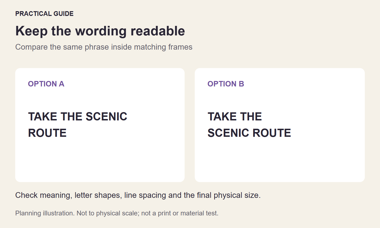
The cover is a schematic planning illustration for this topic, not a physical print sample or a measurement of your artwork.